

پس از پیاده سازی گسترده CSS Grid Layout، یک سوال در زمینه توسعه وب فرانت اند، برجسته شد:
آیا هنوز از Flexbox استفاده می شود؟
Grid در حال حاضر توسط همه مرورگر های اصلی به اندازه Flexbox نیز پشتیبانی میشود. اما در پاسخ به سوال بالا، مثبت است. بله، Flexbox هنوز بخش مهمی از CSS است.
در این مقاله قصد داریم چند روش موثر در تصمیم گیری در مورد زمان استفاده از Flexbox و زمان استفاده از Grid برای مقابله با پروژه های توسعه وب ارائه دهیم.
Flexbox چیست ؟
CSS Flexible Box Layout یا به اختصار Flexbox در سال 2012 در مرورگرها قرار گرفت و پدید آمد. طراحان و توسعه دهندگان وب که سالها از float ها و کتابخانه های طرح شخص ثالث استفاده کرده بودند، از این ماژول جدید CSS با اشتیاق استقبال کردند. اگرچه کمی طول کشید تا به آن عادت کنند و بر روی عملکردهای داخلی آن تسلط کامل بدست آورند.
یک کانتینر flex را می توان به صورت زیر در داکیومنت CSS تعریف کرد:
.container { display: flex; }
از زمان معرفی Flexbox ، مواردی مانند ایجاد ستون هایی با طول مساوی بدون در نظر گرفتن میزان محتوای آنها ، محوریت عناصر به صورت افقی و عمودی، ترسیم و فاصله گذاری پیوندهای ناوبری در امتداد یک یا چند خط افقی بسیار آسان شده است.
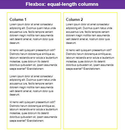
پیچیدن ستون ها در داخل یک کانتینر flex برای رسیدن به ستون هایی با طول کافی است. به قطعه کد زیر دقت و توجه کنید:
HTML:
<header>
<h1 class=”page-title”>Flexbox: equal-length columns</h1>
</header>
<div class=”container”>
<article>
<h2 class=”article-title”>Column 1</h2>
<p>Lorem ipsum dolor sit amet consectetur adipisicing elit. Ducimus quam natus unde accusamus iure, facilis tempore veniam dolorem magni mollitia nam assumenda velit deleniti amet et, nostrum dolor quia deserunt.
</p>
<p>Id nemo velit quisquam praesentium odit? Distinctio harum doloremque similique ex, laborum reiciendis error soluta a laudantium molestiae, quae dolorum illo deleniti doloribus quibusdam sit, ipsam assumenda saepe eveniet? Exercitationem.</p>
</article>
<article>
<h2 class=”article-title”>Column 2</h2>
<p>Lorem ipsum dolor sit amet consectetur adipisicing elit. Ducimus quam natus unde accusamus iure, facilis tempore veniam dolorem magni mollitia nam assumenda velit deleniti amet et, nostrum dolor quia deserunt.
</p>
<p>Id nemo velit quisquam praesentium odit? Distinctio harum doloremque similique ex, laborum reiciendis error soluta a laudantium molestiae, quae dolorum illo deleniti doloribus quibusdam sit, ipsam assumenda saepe eveniet? Exercitationem.</p>
</article>
</div>
CSS :
/* general rules */
* {
box-sizing: border-box;
}
body {
margin: 0;
padding: 0;
height: 100vh;
width: 100%;
}
h1 {
margin: 0;
font-size: 2rem;
line-height: 1;
}
h2 {
margin: 0;
font-size: 1.5rem;
line-height: 1;
}
p {
margin: 0 0 1.5rem 0;
line-height: 1.5;
max-width: 80ch;
}
/* components */
header {
background: rebeccapurple;
color: white;
padding: 1rem;
margin-bottom: 1.5rem;
text-align: center;
}
article {
outline: 3px solid yellow;
padding: 1rem;
margin-bottom: 1rem;
}
.article-title {
margin-bottom: 0.5rem;
margin-top: 1rem;
}
.container {
max-width: 80ch;
margin: 0 auto;
margin-bottom: 3rem;
/* flexbox */
display: flex;
gap: 20px;
}
خروجی :
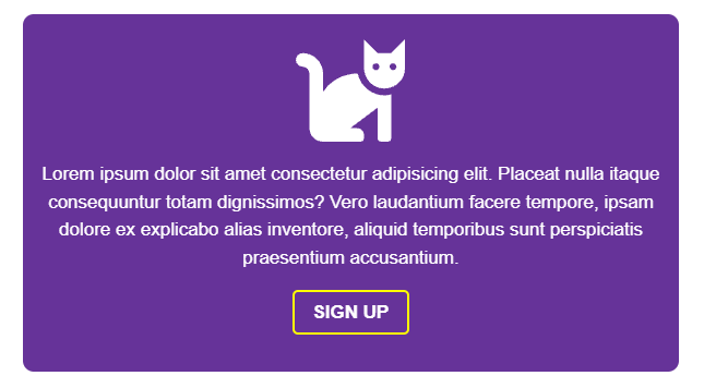
در مورد محوریت محتوا به صورت افقی و عمودی، باید خطوط کد زیر را به یک کانتینر flex اضافه کنید:
.hero {
display: flex;
flex-direction: column;
/* centers vertically */
justify-content: center;
/* centers horizontally */
align-items: center;
}
دمو :
HTML:
<div class=”hero”>
<svg class=”hero-icon” style=”fill:white;” viewBox=”0 0 512 512″ width=”100″ title=”cat”>
<path d=”M290.59 192c-20.18 0-106.82 1.98-162.59 85.95V192c0-52.94-43.06-96-96-96-17.67 0-32 14.33-32 32s14.33 32 32 32c17.64 0 32 14.36 32 32v256c0 35.3 28.7 64 64 64h176c8.84 0 16-7.16 16-16v-16c0-17.67-14.33-32-32-32h-32l128-96v144c0 8.84 7.16 16 16 16h32c8.84 0 16-7.16 16-16V289.86c-10.29 2.67-20.89 4.54-32 4.54-61.81 0-113.52-44.05-125.41-102.4zM448 96h-64l-64-64v134.4c0 53.02 42.98 96 96 96s96-42.98 96-96V32l-64 64zm-72 80c-8.84 0-16-7.16-16-16s7.16-16 16-16 16 7.16 16 16-7.16 16-16 16zm80 0c-8.84 0-16-7.16-16-16s7.16-16 16-16 16 7.16 16 16-7.16 16-16 16z” />
</svg>
<p class=”hero-content”>Lorem ipsum dolor sit amet consectetur adipisicing elit. Placeat nulla itaque consequuntur totam dignissimos? Vero laudantium facere tempore, ipsam dolore ex explicabo alias inventore, aliquid temporibus sunt perspiciatis praesentium accusantium.</p>
<button class=”signup-btn”>Sign Up</button>
</div>
CSS:
/* general styles */
* {
box-sizing: border-box;
}
body {
margin: 0;
padding: 0;
height: 100vh;
width: 100%;
display: flex;
justify-content: center;
align-items: center;
}
p {
margin: 0 0 1rem 0;
line-height: 1.5;
}
/* components styles */
.hero {
max-width: 80ch;
background-color: rebeccapurple;
color: white;
padding: 1rem;
border-radius: 10px;
text-align: center;
/* flexbox */
display: flex;
flex-direction: column;
/* centers vertically */
justify-content: center;
/* centers horizontally */
align-items: center;
}
.hero-icon {
margin-bottom: 1rem;
}
.hero-content {
max-width: 60ch;
}
.signup-btn {
margin-bottom: 1rem;
border: 2px solid yellow;
border-radius: 5px;
padding: 0.5rem 1rem;
text-align: center;
text-transform: uppercase;
background-color: transparent;
color: white;
font-weight: bold;
}
خروجی دمو :
در آخر نیز مرتب کردن مجموعه ای از پیوندها هرگز کار آسان و بدون مشکل نخواهد بود:
.links-container {
display: flex;
/* shortcut to specify direction (horizontal) and wrapping behavior */
flex-flow: row wrap;
gap: 1rem;
}
CSS Grid Layout چیست ؟
در سال 2017 ، CSS Grid Layout شروع به دریافت یک پشتیبانی گسترده از مرورگر کرد. طبق تحقیقات Grid layout، یک مدل طرح بندی جدید برای CSS است که توانایی های قدرتمندی برای کنترل اندازه و موقعیت جعبه ها و محتویات آنها دارد.
با استفاده از Grid ، قدرت ایجاد انواع طرح بندی های قوی در وب بسیار افزایش یافته است. به طوری که Jen Simmons ، متخصص CSS و مدافع مشهور Grid ، طراحان و توسعه دهندگان وب را تشویق کرده است تا در طرح بندی خود مهارت بیشتری به خرج دهند و از الگوهای رایج و بیش از حد استفاده کنند.
Grid نیز هنگام ایجاد یک طرح بندی پیچیده که به طور کلی از کد زیادی استفاده نمی کند، به هیچ گونه float یا هک های دیگر احتیاج ندارد و کاملا آسان است.
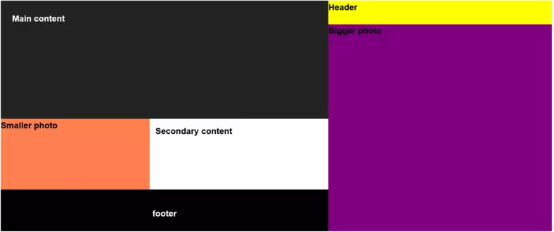
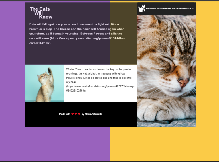
در اینجا یک دموکه Grid فقط در اندازه های بزرگتر صفحه نمایش می دهد را بررسی میکنیم:
HTML :
<div class=”container”>
<header class=”header”>
<nav class=”nav”>
<ul class=”nav-list”>
<li class=”nav-item logo”><a href=”#” class=”nav-link”><svg viewBox=”0 0 512 512″ width=”100″ title=”cat”>
<path d=”M290.59 192c-20.18 0-106.82 1.98-162.59 85.95V192c0-52.94-43.06-96-96-96-17.67 0-32 14.33-32 32s14.33 32 32 32c17.64 0 32 14.36 32 32v256c0 35.3 28.7 64 64 64h176c8.84 0 16-7.16 16-16v-16c0-17.67-14.33-32-32-32h-32l128-96v144c0 8.84 7.16 16 16 16h32c8.84 0 16-7.16 16-16V289.86c-10.29 2.67-20.89 4.54-32 4.54-61.81 0-113.52-44.05-125.41-102.4zM448 96h-64l-64-64v134.4c0 53.02 42.98 96 96 96s96-42.98 96-96V32l-64 64zm-72 80c-8.84 0-16-7.16-16-16s7.16-16 16-16 16 7.16 16 16-7.16 16-16 16zm80 0c-8.84 0-16-7.16-16-16s7.16-16 16-16 16 7.16 16 16-7.16 16-16 16z” />
</svg></a></li>
<li class=”nav-item”><a href=”#” class=”nav-link”>Magazine</a></li>
<li class=”nav-item”><a href=”#” class=”nav-link”>Merchandise</a></li>
<li class=”nav-item”><a href=”#” class=”nav-link”>The Team</a></li>
<li class=”nav-item”><a href=”#” class=”nav-link”>Contact Us</a></li>
</ul>
</nav>
</header>
<div class=”big-kittie”>
</div>
<main class=”main”>
<h1 class=”main-title”>The Cats <br> <span class=”space-1″>Will </span> <br> <span class=”space-2″>Know</span></h1>
<p class=”main-paragraph”>Rain will fall again on your smooth pavement, a light rain like a breath or a step. The breeze and the dawn will flourish again
when you return, as if beneath your step. Between flowers and sills the cats will know.(https://www.poetryfoundation.org/poems/51514/the-cats-will-know)
</p>
</main>
<section class=”kittie”>
</section>
<section class=”verse”>
<p class=”verse-para”>Winter. Time to eat fat and watch hockey. In the pewter mornings, the cat,
a black fur sausage with yellow Houdini eyes, jumps up on the bed and tries to get onto my head. (https://www.poetryfoundation.org/poems/47787/february-56d2288025b1e)</p>
</section>
<footer class=”footer”>
<p class=”footer-para”>Made with ❤️❤️❤️ by Maria Antonietta</p>
</footer>
</div>
CSS:
/* general styles */
* {
box-sizing: border-box;
}
body {
margin: 0;
padding: 0;
height: 100vh;
background: linear-gradient(90deg, rgba(153,98,189,1) 50%, rgba(251,203,71,1) 50%);
}
ul {
list-style: none;
margin: 0;
padding: 0;
}
a {
text-decoration: none;
}
p {
margin: 0 0 0.5rem 0;
line-height: 1.5;
}
img {
max-width: 100%;
height: auto;
display: block;
margin: 0;
padding: 0;
}
svg {
fill: white;
}
/* components */
.container {
/*height: 100vh;*/
max-width: 1200px;
margin: 1rem auto;
}
/* header part */
.header {
text-align: center;
}
.nav {
max-width: 100%;
/*padding: 1rem;*/
}
.nav-list {
width: 100%;
padding-bottom: 1rem;
padding-top: 1rem;
background-color: #222;
opacity: 0.8;
}
.nav-item {
margin-bottom: 1rem;
}
.logo a svg {
transform: rotate(-10deg);
transition: all 0.2s;
}
.logo a:hover svg,
.logo a:focus svg {
transform: rotate(0deg);
}
.nav-link {
color: white;
text-transform: uppercase;
font-weight: bold;
}
.nav-link:hover,
.nav-link:focus {
text-decoration: underline;
}
.big-kittie {
background-image: url(“https://images.unsplash.com/photo-1500603720222-eb7a1f997356?crop=entropy&cs=srgb&fm=jpg&ixid=MnwxNDU4OXwwfDF8cmFuZG9tfHx8fHx8fHx8MTYyNzI0MTk3OQ&ixlib=rb-1.2.1&q=85”);
background-repeat: no-repeat;
background-position: center center;
background-size: cover;
min-height: 300px;
}
.main {
padding: 2rem;
background-color: #222;
color: white;
opacity: 0.8;
}
.main-title {
margin-top: 0;
line-height: 0.8;
}
.main-paragraph {
max-width: 80ch;
}
.space-1 {
margin-left: 2rem;
}
.space-2 {
margin-left: 4rem;
}
.verse {
padding: 1rem;
background-color: white;
}
.verse-para {
max-width: 80ch;
}
.kittie {
background-image: url(“https://images.unsplash.com/photo-1592194996308-7b43878e84a6?crop=entropy&cs=srgb&fm=jpg&ixid=MnwxNDU4OXwwfDF8cmFuZG9tfHx8fHx8fHx8MTYyNzI1MzM5MA&ixlib=rb-1.2.1&q=85”);
background-repeat: no-repeat;
background-position: center center;
background-size: cover;
min-height: 500px;
}
.footer {
padding: 2rem;
text-align: center;
background-color: #000;
color: white;
}
/* media queries */
@media (min-width: 767px) {
.container {
display: grid;
grid-template-columns: 1fr 1.2fr 1.5fr;
grid-template-rows: 1fr 4fr 3fr 2fr;
}
.header {
grid-area: 1 / 2 / 2 / 3;
z-index: 1;
background-color: #000;
padding-bottom: 100%;
}
.nav {
background-color: #000;
padding-right: 0.5rem;
padding-left: 0.5rem;
}
.nav-list {
background-color: #000;
opacity: 1;
}
.big-kittie {
grid-area: 1 / 3 / 5 / 5;
}
.main {
/* row start, row end, col start col end */
grid-area: 1 / 1 / 3 / 2;
}
.kittie {
grid-area: 3 / 1 / 4 / 2;
}
.verse {
grid-area: 3 / 2 / 4 / 3;
font-size: 0.8rem;
}
.footer {
grid-area: 4 / 1 / 5 / 3;
display: grid;
align-items: center;
}
}
@media (min-width: 960px) {
.header {
grid-area: 1 / 4 / 4 / -1;
background-color: transparent;
padding-bottom: 0;
}
.nav {
background-color: #222;
opacity: 0.8;
}
.nav-list {
background-color: #222;
opacity: 0.8;
}
.main {
/* row start, row end, col start col end */
grid-area: 1 / 1 / 3 / 3;
}
.main-paragraph {
line-height: 1.6;
letter-spacing: 1px;
}
.kittie {
min-height: 200px;
}
}
@media (min-width: 1200px) {
.header {
grid-area: 1 / 3 / 2 / -1;
text-align: left;
}
.nav {
opacity: 1;
}
.nav-list {
display: grid;
grid-auto-flow: column;
opacity: 1;
}
.nav-item {
font-size: 0.8rem;
align-self: center;
text-align: right;
margin-bottom: 0;
}
.logo {
text-align: left;
}
.header svg {
width: 50px;
height: 50px;
}
.big-kittie {
grid-area: 2 / 3 / 5 / -1;
}
.main-paragraph {
font-size: 1.2rem;
max-width: 60ch;
line-height: 1.6;
letter-spacing: 1px;
}
.verse-para {
font-size: 1.1rem;
line-height: 1.6;
}
}
خروجی :
در دمو بالا، برای ایجاد شبکه اصلی برای کل صفحه در اندازه کامل، div کانتینر خود را به یک grid container تبدیل و سپس آن را به ستون ها و سطرها تقسیم کرده ایم:
.container {
display: grid;
grid-template-columns: 1fr 1.2fr 1.5fr;
grid-template-rows: 1fr 4fr 3fr 2fr;
}
واحد fr واحد اندازه گیری انعطاف پذیر جدیدی است که با CSS Grid Layout معرفی شده است.
قسمت fr به معنی کسری است ، زیرا نشان دهنده کسری از فضای موجود در ظرف شبکه است.
استفاده از fr به جای یک واحد ثابت مانند px ، به این معنی است که به مرورگر اجازه دهید ریاضی مورد نیاز برای ایجاد طرح را انجام دهد ، که فکر می کنم در بیشتر موارد ترجیح داده می شود.
پس از آماده شدن شبکه ، زمان آن فرا رسیده که عناصر کودک را داخل آن قرار دهید.
چند روش مختلف برای انجام این کار وجود دارد. در نسخه نمایشی بالا ، من از شماره خطوط شبکه و ویژگی grid-area استفاده کردم که کار را در یک خط کد انجام می دهد.
به عنوان مثال ، کد ارائه مطالب اصلی من در اینجا آمده است:
.main {
/* row start, row end, col start col end */
grid-area: 1 / 1 / 3 / 3;
}
هنگامی که همه بخش ها در داخل شبکه قرار می گیرند ، خروجی به صورت زیر است: